Update: Cryptomundo Swag Part Deux Virgule Cinq
Posted by: Craig Woolheater on February 22nd, 2011
We shared some preliminary designs for Cryptomundo merchandise here on the site last month.
We listened to Cryptomundo readers’ suggestions and opinions.
Behold, the second wave of designs.
Once again, Steve Busti, owner of the Museum of the Weird in Austin, TX, designed the artwork.
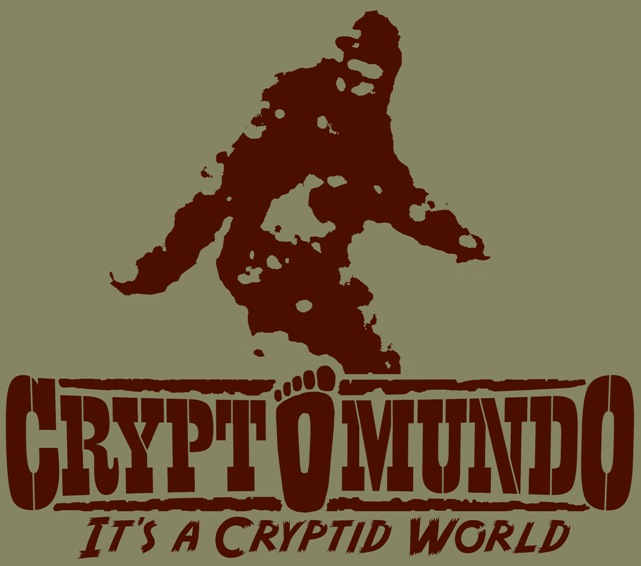
The above design would be one color, reddish brown, on a solid color shirt.
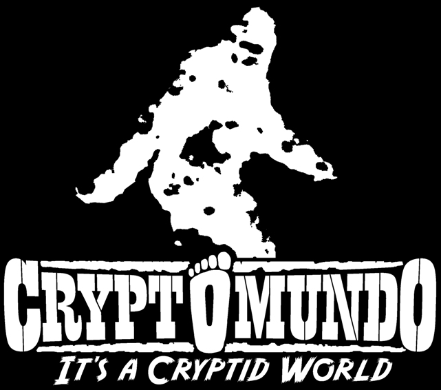
The above design would be two color, glow in the dark, on a black shirt.
Here is another cryptid design that could be used on a Cryptomundo shirt.
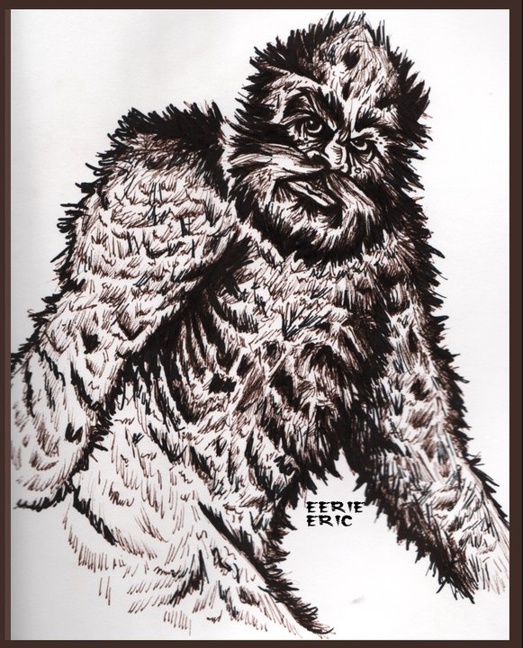
The design was submitted by artist and Cryptomundo fan, Eerie Eric.
Eerie Eric has been contributing the cryptid illustrations for Lyle Blackburn’s Monstro Bizarro blog on the Rue Morgue website.
About Craig Woolheater
Co-founder of Cryptomundo in 2005.
I have appeared in or contributed to the following TV programs, documentaries and films:
OLN's Mysterious Encounters: "Caddo Critter", Southern Fried Bigfoot, Travel Channel's Weird Travels: "Bigfoot", History Channel's MonsterQuest: "Swamp Stalker", The Wild Man of the Navidad, Destination America's Monsters and Mysteries in America: Texas Terror - Lake Worth Monster, Animal Planet's Finding Bigfoot: Return to Boggy Creek and Beast of the Bayou.


Absolutely love the blurry image look. There should be dozens of photos/images that, when rendered this way, make great-looking swag. Consider, though, removing the “It’s a Cryptid World” altogether. It’s actually more mysterious without this line, and promotes an “in-the-know” feeling that all good t-shirts for societies have.
I’ve sold clothing for years, and I hope you don’t get too caught up with the infinite discussions of colors. Try something like this… 2011 products: Patty on Brown, Surgeon on Green. 2012 products: Mothman on Dark Blue, Black Cat on White. Etc.
Examine how the company Life Is Good goes to market with their designs. The color choices are seasonal, and they don’t make every design in every color to try to make everyone happy. This way, when new designs come out, there is excitement.
Definitely err on the side of larger sizes! Better to get stuck with XL’s than Mediums.
And certainly look at coffee mugs, beach towels, and anything else that doesn’t require sizing. (Lots of sizes eats up small budgets).
Yep, they’ve improved. Nice colors on the first —specially if the background has some rough “texture”, you know?
Hey, if we’re gonna have glow-in-the-dark shirts, how about some designs featuring Mothman or the Jersey Devil, showing the beasties with glowing red eyes? 😉
How do I order?
Colors are good. Like the two shown. You know, I have to agree on deleting “it’s a cryptid world.” Just Cryptomundo.
I think you should treat Cryptomundo as a real logo Craig.
You need to “brand” it. Keep the tagline “Its a Cryptid World” in the same place all the time.
Trademark it and lock it in so it appears the same whenever it is used.
Keep the logo separate from any of the main designs that may be created (by anyone).
(A Mothman, Mokele-mbembe…etc).
No one should be able to use it without your permission.
It should appear on everything right down to your stationary and swag.
For instance, on the T-shirt shown above.
Put the blurred Patty on the front, maybe with a footprint worked into the design (in the same “blurred” style as the Patty). Then put the Cryptomundo logo on the back or one sleeve of the shirt. It may cost a bit more for the silkscreening, but you would just need to factor that into price of the T-shirt. Once a screen is cut for the Cryptomundo logo it could be used on all future T-shirts with different creatures treatments used for the frontal designs.
As it is now, a whole different font is being used for Crytomundo. Then another font is used for your tagline. Too busy, too many fonts leads to confusion and a disjointed eye path.
No offense Steve, but the fonts you are using do not match the “nature” of the main image (Patty).
But the effect you put on the iconic BF stance is great, I think the legs and feet should be shown also (and maybe a more detailed hint of the eyes of Patty). Perhaps with a large footprint in a halftone behind the Patty. Or a line of BF prints meandering across the imprint area. If you really want text mixed into the main image, have it say something like “Bluff Creek Boogie” or something clever and catchy in a font with the similar splattered effect as the Patty.
You want to have a T-shirt that Jane Goodall would wear as she is out communing with a band of chimpanzees. The chimpanzee must want the shirt.
One idea would be to buy T-shirts made of Humboldt hemp to symbolize all that is wild, mind-altering and hidden in the remote north woods of USA. But that would just be an inside extra detail for promo purposes.
I like the first one. I wish the logo is on the back. For some reason with a big logo on the front makes me feel like I am wearing a children’s shirt.
Really like the reddish-brown design. Big thumbs up there!
It kinda looks like a “Bathing Ape” or “BAPE” brand’s design.