Author’s Nightmare: Book Covers
Posted by: Loren Coleman on September 1st, 2009
Ever wonder about the evolution of that art you are viewing on a book cover of the title you are reading right now?
Writing a book is not any easy task. But what happens after an author finishes his or her manuscript can be the second most difficult part of the journey.
Authors realize that the first view potential readers have of their books has a lot to do with how successful it might be. The cover is literally the face of the work seen by the world.
After all the edits and changes are made in the final proof, one of the biggest decisions is what kind of cover does your book get.
Most authors don’t get to have much say in what the cover looks like or sometimes even what art goes inside the book. The bigger the publisher, actually, the greater distance an author is often kept from this part of the process. That is a mistake I think, of course, because I biased. I think it backfires in how passionately an author feels about selling the book, believe it or not.
One of the things that does sometimes happen after you have a few books under your belt is that the publisher may begin to listen to you.
Today, I thought I’d pull back the curtain on this process a bit and share a couple book covers that I rejected and the reasons why.
First up…take a look at this:

This is the draft cover that was initially sent me, telling me this was going on my 2003 Bigfoot book.
Whoa, did it freak me out!
You probably can see some of the errors that jumped out at me.
“Big Foot” spelled as two words, on two lines, was high on the list of turnoffs.
Then the whole idea the designer would show apelike footprints in snow compounded the mistakes. Since the book was about Sasquatch and Bigfoot, mainly, why would you want to give the reader the idea it was about the Abominable Snowmen? Furthermore, Bigfoot tracks look like oversized human footprints (with five toes straight outward), so why have gorillas’ tracks in the snow!??
So, back to the drawing board. The S&S artists produced the following image, which was obviously inspired by the Patterson-Gimlin film. It worked fine, especially reduced, for the cover; see below.
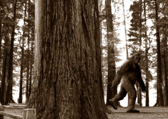

The end result: Bigfoot! The True Story of Apes in America. New York: Simon and Schuster, 2003.
Next up, this example of the first very rough draft cover of the 2002 Mothman book:
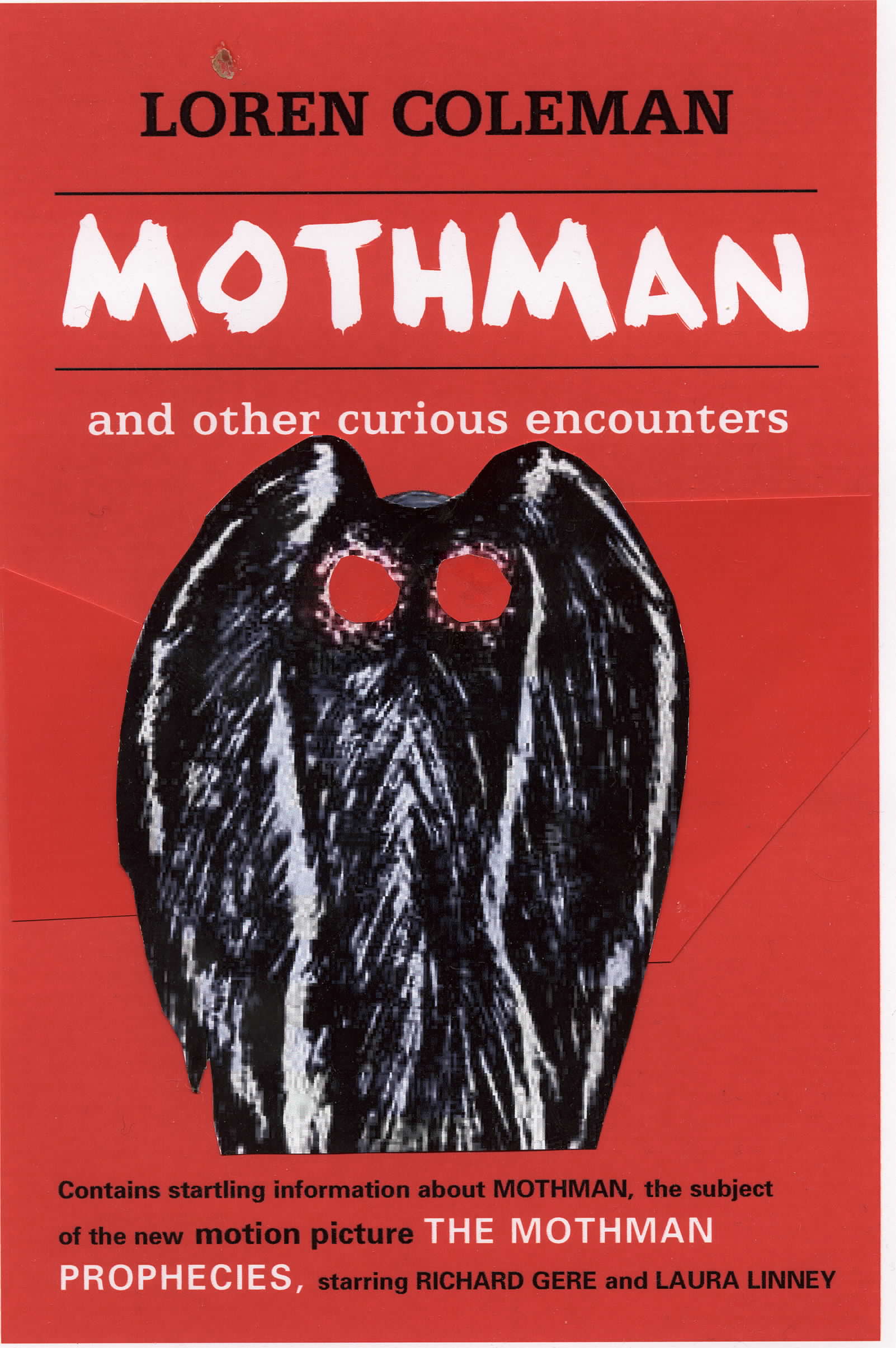
You can come up with your own short list of reasons why the above had to be rejected, can’t you?
Needless to say, what was required was a quick alternative to what seemed like almost copyart thrown together on this cover.
I got ahold of my friend, cryptozoology artist Bill Rebsamen and asked him if he could create a quick drawing of Mothman based on what the first eyewitnesses had described. Working closely with Bill, he painted a Mothman that was very much on target.
I presented Bill’s art to the publisher, and while they did have their way with it (making a blowup of part of the image fill the cover), it does work well.

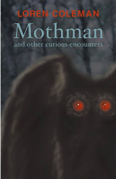
Finally, the final cover graced Mothman and Other Curious Encounters, Paraview Press, now Cosimo Books, 2002.
A happy, creative, beautiful book cover makes for an author who is a passionate proud promoter of his own work. 🙂

About Loren Coleman
Loren Coleman is one of the world’s leading cryptozoologists, some say “the” leading living cryptozoologist. Certainly, he is acknowledged as the current living American researcher and writer who has most popularized cryptozoology in the late 20th and early 21st centuries.
Starting his fieldwork and investigations in 1960, after traveling and trekking extensively in pursuit of cryptozoological mysteries, Coleman began writing to share his experiences in 1969. An honorary member of Ivan T. Sanderson’s Society for the Investigation of the Unexplained in the 1970s, Coleman has been bestowed with similar honorary memberships of the North Idaho College Cryptozoology Club in 1983, and in subsequent years, that of the British Columbia Scientific Cryptozoology Club, CryptoSafari International, and other international organizations. He was also a Life Member and Benefactor of the International Society of Cryptozoology (now-defunct).
Loren Coleman’s daily blog, as a member of the Cryptomundo Team, served as an ongoing avenue of communication for the ever-growing body of cryptozoo news from 2005 through 2013. He returned as an infrequent contributor beginning Halloween week of 2015.
Coleman is the founder in 2003, and current director of the International Cryptozoology Museum in Portland, Maine.




This is a very interesting topic for me, and I appreciate Loren’s thoughts and musings put forth here. Fascinating to see the evolution that these books covers undergo. I would have liked to see even more, for instance, what stages did the Mysterious America cover go through? Good stuff here.
I’d also be interested to hear some of the experiences other published authors on Cryptomundo have had concerning book covers.
Many years ago, I worked briefly for a publisher as a free-lance illustrator. I was surprised to discover that I would not be able to read the complete book I was to illustrate, nor would I even be able to discuss the cover with the author. Although I can understand the reluctance to release a copy of a not-yet-published work, the overall process seemed like a less-than-optimal way of working. I am saddened to hear that it is still in existence.
Oh God, Loren, welcome to my world! Speaking as an editor for a major specialty publisher, I can tell you that the problem is that covers are usually determined by the marketing or sales department, and their preferences are based on what they think their booksellers — not the end consumers (readers) — will want to see. Booksellers, whether bricks-and-mortar or online, generally have only a sketchy idea of what the book in question is about — moreso for niche titles — so they are often unaware of the subtle content-related points that mean so much to the author and consumer. The reason that publishers aren’t inclined to listen to authors is that they feel that the authors are too involved in the details of the subject to provide a simple, immediately-understandable cover concept, which is what usually appeals to the bookseller. Sometimes they’re right; often they’re not. And then there are the aesthetic considerations: which font? Color? Reversed font? Bullets? Which photo? Or should we hire an artist? Should the title or subtitle violate the main graphic? What will the spine say? In my job, we’ve discussed a single cover for more than four hours. It’s a wonder that so many covers actually turn out rather well.
The Mothman cover was just a rough draft—I’m sure it was not intended as the ULTIMATE cover to go with.
The BigFoot Bookcover was very misleading, however.
Mystery_Man is right. Good subject.
Looking forward to some of the “stories.” 🙂
As a designer, the art of a book’s cover is very important to me. Editors and publishers should realize that books are the last frontier of original graphic design included in a product, now that the big album jackets of yesteryear’s LP records —that shrinked to puny CD size in the 80s— are being turned into jpeg compressed 200×200 pixel images of tunes to be displayed on MP3 players.
And with the advent of Kindle and other fancy e-readers, how long before the art in books goes the way of the dodo as well?
Bottomline: work with authors in trying to solve the art of a book, the same way record companies work with music bands to create publicity merchandise.
And it doesn’t even need to have an obvious illustration: you can solve it entirely with typography! —just look at Guillermo del Toro’s gorgeous art cover in his first book The Strain, which I’m gobbling up right now.
Then again, if you have a powerful image, the book can become a cultural icon —exhibit A: Whitley Strieber’s Communion. 😉
PS: The Bigfoot! cover design is beautiful; with both the sepia colors and the stylish typography, it subtly tells the reader that the subject will be treated seriously. Future crypto-authors take note 🙂
Speaking from the viewpoint of the reader/purchaser, the cover is a major point for me. I have the Bigfoot! The True Story of Apes in America book. I love the cover it has.
The first cover, turned me off immediately. Was it the Snow? No. Rather is was the huge font (as Loren brought out). That coupled with the exclamation mark, gave me the reader, the impression it was out for sensationalism only. Not that it was going to be the insightful and interestingly fun read it is.
The first Mothman and Other Curious Encounters cover, even if a quick mock up, looked as if someone just slapped something together and gave no true thought to it. If the cover is half-assed then the book probably is too.
The second one, though somewhat better, still does not pique my interest. I will probably end up buying it, anyway, only because I enjoyed Loren’s other book. I know nothing much about the Mothman. I figure Loren’s book is the best one to start with.
I wish more authors had more say in their covers. They have just as much blood, sweat and tears invested in the book as the publisher, if not more.
My pet peeves on books: Glaringly large fonts; glitter; metallic lettering; embossed covers (unless it is embossed leather), especially embossed paperbacks; super slick covers (exception – photography based books) and finally reference books that have either too small font size or too large inside the book.
Size 12 font. That’s it. Stick to it. Sure double spaced size 14 font is easy to read, but those books typically have 100 pages tops, so you are only getting a 1/3 of book, if you condensed it down to 12 with no double spacing. When I see large font inside.. I move on.
Just my opinion as an avid reader and purchaser of books both old and new.
My first solo book comes out this month, from the University of Iowa Press. Luckily for me, I am both a writer AND artist, and that is how I created my book, so my first solo book used one of my own illustrations as the cover image.
However, the first design of the cover (the font, color, layout, etc.) had some problems. So, stating some suggestions to the Press in a POSITIVE way, they came out with a second version of the cover that was very nice!
As a book cover designer, I can say that there are many issues with all of this. More often than not, the authors do want something that is totally off base. Most of the time, its too much, they want so many things that it ends up looking like a NASCAR. Sure, they may be experts on the subject matter (sometimes self-induced), but they don’t know anything about advertising or marketing typically. Or design for that matter. Author’s expertise lies within the pages, the designers expertise lies within the cover jacket. It’s critical to understand the author’s vision, but there is a likely a compromise made, and for the better. It’s actually a fun process in the end.